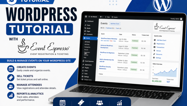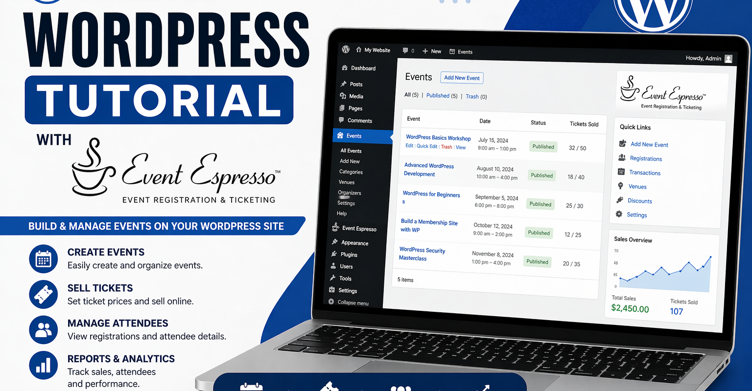
If your event page is getting traffic but not registrations, the issue is rarely technical. In most cases, it comes down to how the experience is structured.
This is one of the most common problems with Event Espresso setups. Everything works, but people don’t convert.
The problem most people don’t see
When registrations are low, the first instinct is to assume something is broken. The plugin, the payment gateway, or WordPress itself.
In reality, most setups are functioning exactly as configured. The issue is that they are not designed from the user’s perspective.
People don’t abandon event bookings because the system failed. They abandon them because something felt unclear, difficult, or uncertain.
That distinction matters. One requires debugging. The other requires rethinking the experience.
Where conversions are actually lost
The form creates friction
Most registration forms ask for more than they need.
Phone numbers, addresses, additional attendee details, optional fields that aren’t clearly optional.
Each extra field slows the user down. That pause is where drop-off starts.
Ticket options are unclear
It’s common to see ticket options like:
- Standard
- Premium
- VIP
Without clear differences, users are forced to think. When people have to think during checkout, they hesitate.
And hesitation kills conversions.
No clear next step
After submitting a form, users expect confirmation. Not just that it worked, but that they are booked, what happens next, and what they need to do.
If that clarity is missing, uncertainty replaces confidence.
Mobile experience is overlooked
Most users are on mobile, but many setups are still tested on desktop.
Small inputs, tight spacing, and long forms create unnecessary friction on a phone.
If it feels hard to complete, people won’t finish it.
How to identify where your flow is failing
Before making changes, step through the process as a user.
Go through your own registration
- Start on your event page
- Select a ticket
- Complete the form
- Submit and review confirmation
Ask yourself:
- Was anything unclear?
- Did you hesitate anywhere?
- Was the next step obvious?
Test on mobile properly
Don’t skim it. Complete the entire process on your phone.
This is where most issues become obvious.
What a high-converting flow looks like
Simple, structured forms
Only ask for what you need to complete the booking.
If something is not essential, remove it.
Clear ticket hierarchy
Each option should be immediately understandable.
Instead of:
- Standard
- Premium
Use:
- General admission – access to the full event
- VIP – includes priority seating and post-event access
Strong confirmation messaging
After submission, the user should know:
- they are booked
- their payment status
- what happens next
Mobile-first layout
- larger input fields
- clear buttons
- minimal scrolling
The easier it is to complete on mobile, the higher your conversion rate.
The role of messaging in conversions
Most people think conversion ends at form submission. It doesn’t.
Confirmation messages and emails reinforce trust.
If a user isn’t confident after submitting, they are more likely to:
- send a support email
- question whether the booking worked
- avoid booking again
Clear communication reduces friction beyond the initial conversion.
Quick wins you can implement today
- Remove at least one unnecessary form field
- Rewrite ticket names so they are clearer
- Improve your confirmation message
- Test the full flow on mobile
- Replace vague buttons like “Submit” with “Register now”
These are small changes, but they have a measurable impact.
When the issue is deeper
Sometimes it’s not one obvious issue. It’s a combination of small friction points.
That’s when you need to step back and review the whole flow:
- form design
- ticket setup
- messaging
- mobile usability
Looking at it end-to-end usually reveals what’s holding conversions back.
Final thoughts
Event Espresso is not the limiting factor in most cases. The way it’s set up is.
When registrations are low, the fix is rarely technical. It’s almost always about clarity, structure, and reducing friction.
Get those right, and conversions improve.